How the Tudor Logo Evolved from a Rose to the Iconic Red Shield

For any watch brand, the name and symbol printed on the dial are more than decorative details. Over the decades, the emblem of Tudor has evolved alongside the watches themselves, moving from a distinctive early wordmark to the bold shield that defines the brand today. Seen on a dial, each iteration on the Tudor logo reflects a different moment in the brand’s development while maintaining a connection to the historical symbolism that inspired its name.
The First Tudor Wordmarks
On the earliest Tudor watches produced during the 1920s and early 1930s, the dial carried a simple but distinctive wordmark. The name “Tudor” appeared in a typeface that combined refined thick and thin strokes, giving it a slightly Gothic character.
The most noticeable feature was the letter “T.” Its horizontal bar extended across the entire word, stretching above the remaining letters. In an era when many watches carried minimal branding, this elongated “T” created a subtle but recognisable identity.

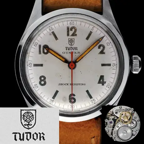
The Arrival of the Tudor Rose
By 1936, Tudor introduced a new emblem that would define the brand for the next phase of its history: the Tudor rose. The rose appeared inside a heraldic shield, positioned above the brand name. The rose evoked heritage and lineage, while the shield suggested protection and resilience.
The word “Tudor” remained below the emblem, now rendered in a medieval-inspired typeface. While visually striking, the ornate lettering sometimes proved less legible on small dials. Even so, the rose-and-shield motif quickly became one of the most recognisable elements of Tudor’s early identity.
The Meaning Behind the Tudor Rose
The symbol was rooted in English heraldry. The Tudor rose combines the red rose of Lancaster and the white rose of York, representing the union of two rival houses. This union followed the marriage of Henry VII of England and Elizabeth of York in 1486, which ended the Wars of the Roses. The combined rose became the emblem of the Tudor dynasty and came to symbolise reconciliation and stability.
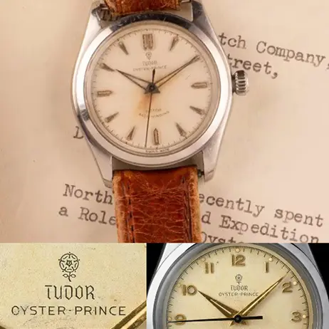
A Brand Takes Shape
The Tudor watch brand was formally established in 1946. During the years that followed, the rose emblem remained a familiar presence on watch dials. For collectors today, these early rose-signed watches represent a distinctive chapter in Tudor’s design history. The symbol conveyed elegance, and the shield beneath it hinted at the robustness that would become central to the brand’s character.
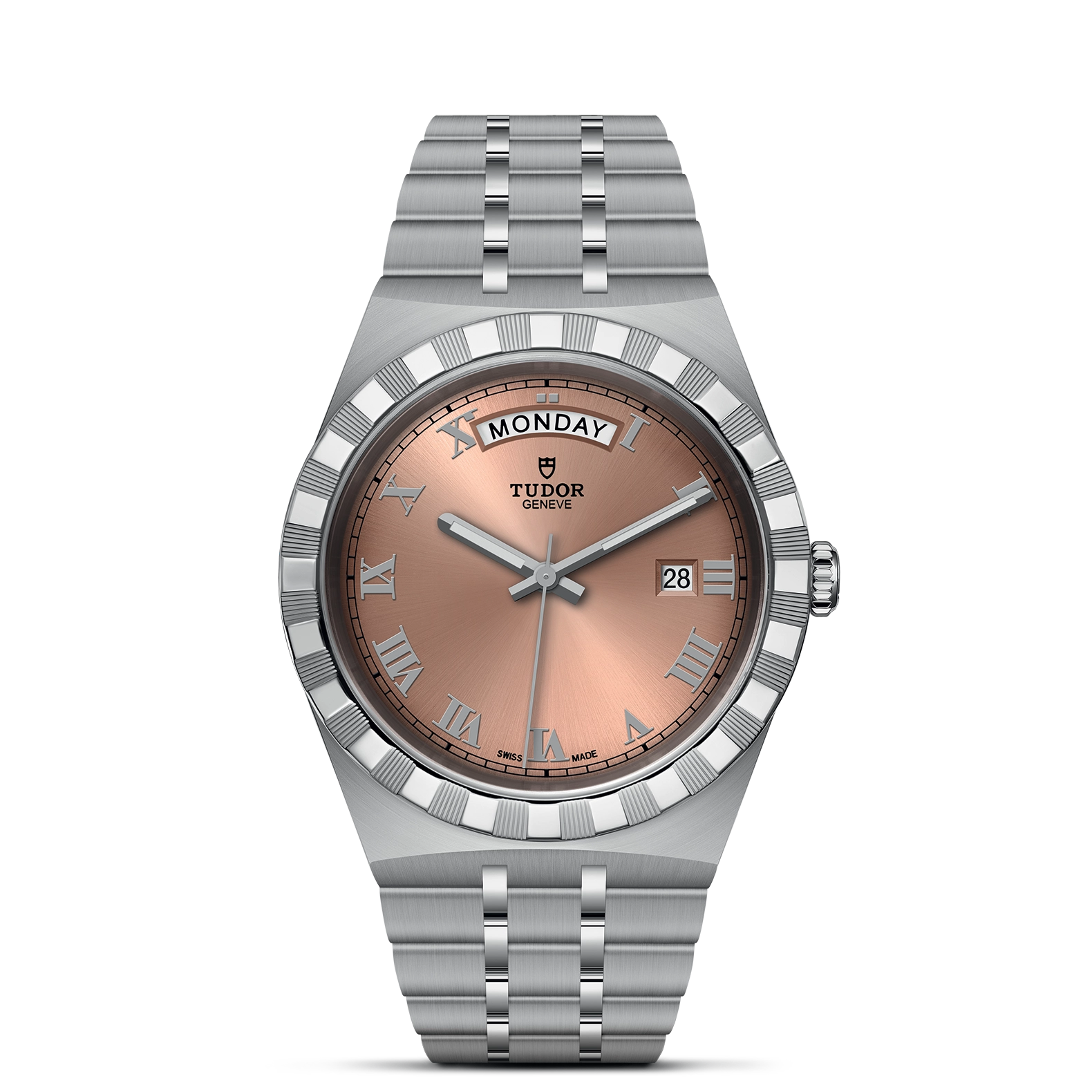
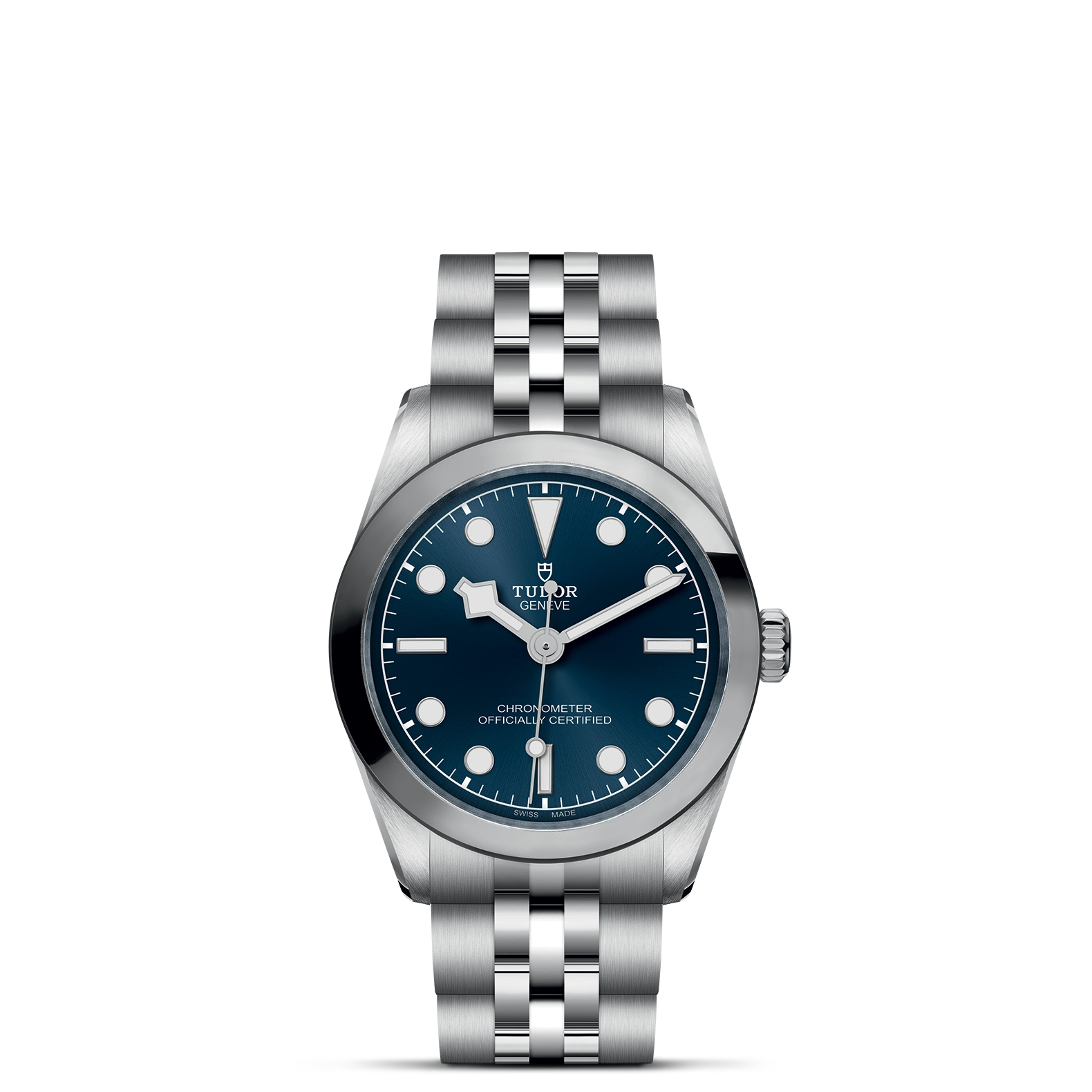
The Rise of the Shield
In the late 1960s, Tudor simplified its visual identity. The rose gradually disappeared from the dial, leaving behind a stand-alone shield. At the same time, the wordmark evolved into a clearer serif typeface. The lettering retained a classical feel but appeared cleaner and more balanced, complementing the strong geometry of the shield.
Over time, this symbol became synonymous with Tudor watches. For many enthusiasts, spotting the red shield on a dial is enough to identify the watch instantly.

Colour, Typography, and Continuity
Even though the rose disappeared from the logo, its legacy did not entirely vanish. The modern emblem features a bright red shield, a colour that quietly echoes the Tudor rose that once defined the brand’s identity.
Typography also reflects a balance between tradition and modern clarity. The early Gothic-inspired lettering eventually gave way to a refined serif typeface that feels classic without appearing dated.
A Symbol That Endures
Looking back, the evolution of the Tudor logo tells a story of refinement rather than radical change. The early wordmark introduced the name, the Tudor rose added historical symbolism, and the shield distilled those ideas into a clear and enduring emblem.
Today, the red shield remains quietly present on the dial: small in scale, but carrying nearly a century of design history.
If you are curious to see how this emblem appears on modern Tudor timepieces, you can visit Cooke & Kelvey, one of the heritage luxury watch retailers in Janpath, New Delhi, where Tudor watches can be experienced up close. Seeing the shield on the dial in person offers a very different appreciation of the symbol that has come to represent the brand’s enduring identity.